Quick Navigation
Introduction
Unlock the power of data visualization effortlessly! Imagine turning your raw data into captivating maps with just a few clicks. Whether you’re a researcher, analyst, or someone with limited time and technical expertise, our user-friendly tool is your shortcut to visually stunning presentations and insights.
In this guide, we’ll introduce you to a seamless solution that taps into World Bank Data, transforming your spreadsheet information into vibrant, eye-catching maps. No complex processes, no steep learning curves – just a simple and effective way to breathe life into your data for meetings, reports, or quick visualizations.
Let’s dive in and unlock the power of visual storytelling with ease!
Getting Started
Getting started is easy! Let’s walk through the inputs and how to provide them.
Data Format
The tool is flexible and can work with various spreadsheet formats. As an example, consider the World Bank Data format:
Country Name    Country Code    Series Name                              Series Code       2000 [YR2000]   2001 [YR2001]   2002 [YR2002]
United States    USA             Population, total                         SP.POP.TOTL       282162411       284968955       287625193
United States    USA             Population growth (annual %)              SP.POP.GROW       1.112768997     0.989741382     0.927797486
United States    USA             CO2 emissions (metric tons per capita)    EN.ATM.CO2E.PC    20.46979674     20.17153693     19.44553028
...
...
Feel free to adapt the series code and value column based on your data structure.
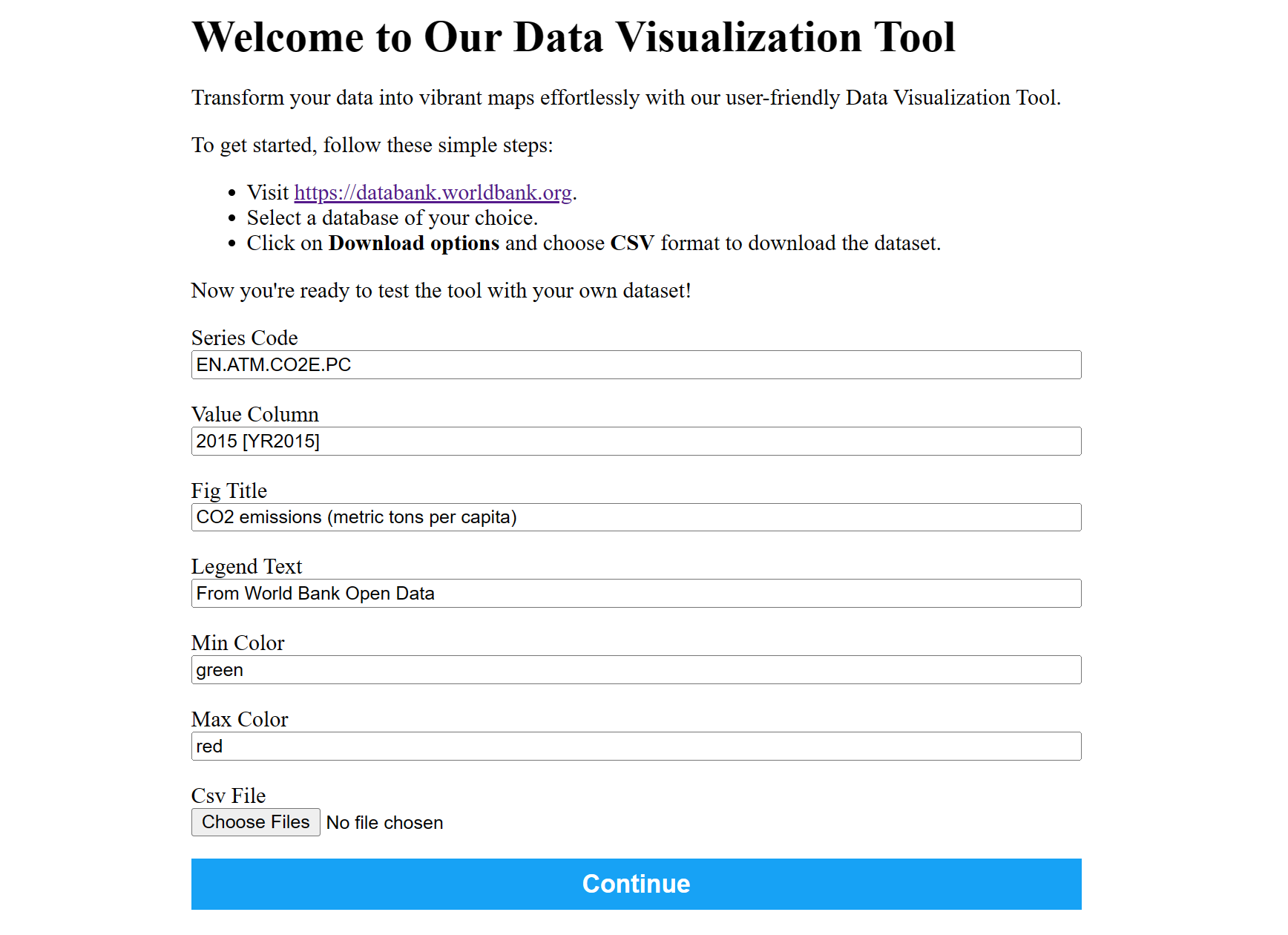
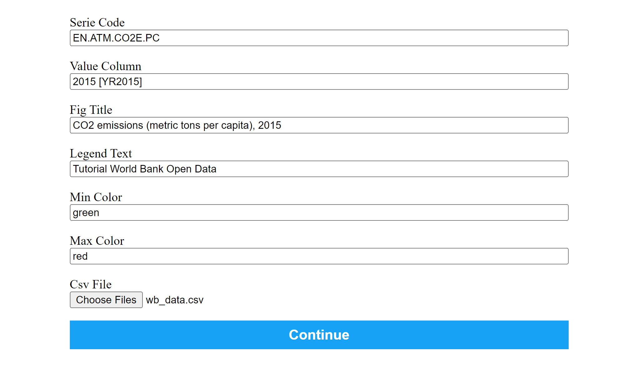
Inputs
Let’s understand the key input parameters:
- Series Code: A unique code representing the type of data you want to visualize, such as population, GDP, or surface area.
- Value Column: The specific column in your spreadsheet that contains the data values corresponding to the series code. For example, “2000 [YR2000]” in the provided World Bank Data format.
- Figure Title: A title for your map, providing context for the data being visualized.
- Legend Text: A description for the legend on your map, aiding viewers in understanding the color scale.
- Min and Max Colors: Choose the colors that represent the minimum and maximum values on your map. You can use color names or hexadecimal codes.
- CSV File: Your data source, following a format similar to the World Bank Data spreadsheet.
Outputs
Generate Map
Provide the input fields and click the “continue” button to create a customized, color-coded map.
Download
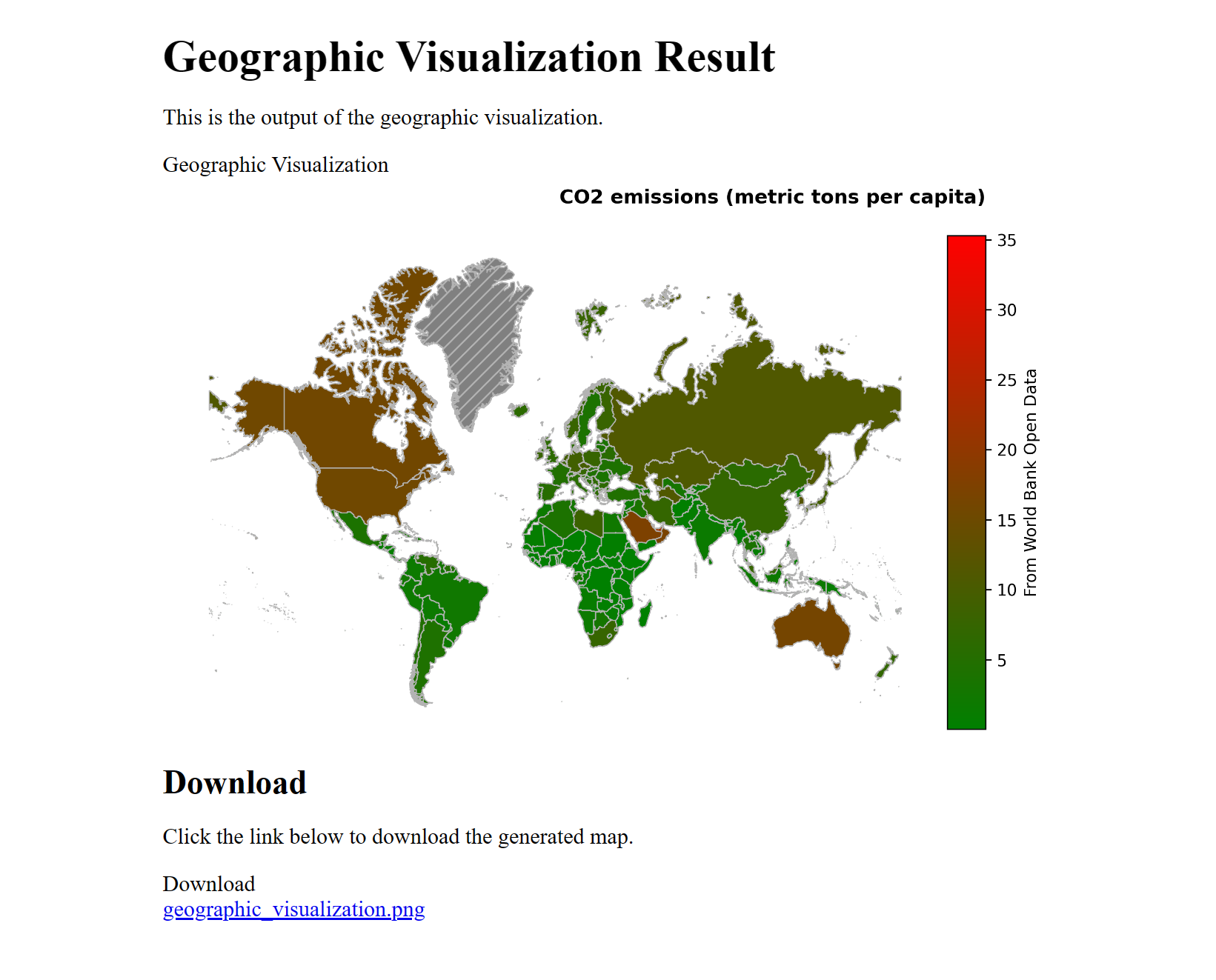
Once generated after few seconds, the image will be displayed you’ll receive a downloadable image link. Save the image for sharing or inclusion in your reports.
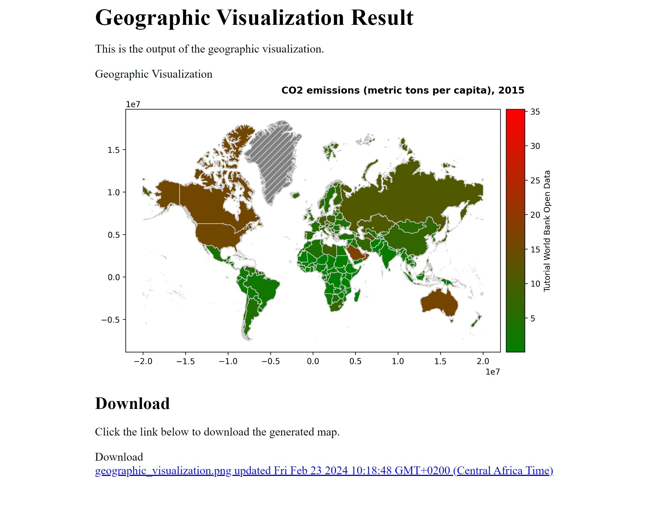
As illustrated in the screenshot above, countries are visually represented based on their data. The hatched section in the map indicates areas where data is missing, providing clarity in interpreting the visualized information.
Conclusion
Visualizing geographic data becomes straightforward with this tool. Whether you’re exploring global trends, regional variations, or country-specific metrics, the tool transforms your spreadsheet data into a visually appealing map. Use it to convey your insights effectively and make data-driven decisions.
Try the tool with your own dataset and start visualizing the world through the lens of your data.
Note: The tool is designed to handle a variety of datasets beyond the World Bank format. Feel free to experiment with different spreadsheet structures for your specific needs.